Path of Exile Mobile review
When Path of Exile Mobile was first unveiled at ExileCon 2019, many thought it was a joke, as Blizzard’s introduction of Diablo Immortal was extremely unsuccessful a year ago. However, when the mobile UI first appeared on video at Aotea Centre in Auckland, New Zealand, it was immediately clear that it was real.
Mobile transition and subtleties
We’ve seen Black Desert Mobile in recent months, even EVE Online comes into play with EVE Echoes. But Path of Exile may be one of the few games that really delivers an experience perfectly suited to the mobile platform. The gameplay loop isn’t as complex as EVE Online, for example, and the mechanics themselves are well designed for mobile devices.
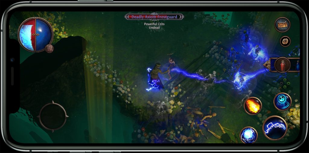
Visually it looks like Path, although the effects are clearly a bit cut down compared to the PC version. The textures really stand out on the phone’s small screen, giving the world around the character the necessary fine detail on the smaller screen. Initially, you can choose between Marauder, Witch or Ranger, as in the Path of Exile 2 demo on the show floor.
Movement flips to the virtual stick on the left side of the screen, and thankfully it tracks your hand. This means that if your grip shifts slightly, there’s no need to reconfigure the control – the stick will recognise this and move accordingly.

Features
Skills are displayed on the right-hand side of the screen with three rather large buttons to use. The main one is slightly larger than the other two, making it accessible. On the move, Mobile feels great. The player explores the map, destroying waves of enemies along the way, picking up any loot they drop off in the process.
The variation looks like a worthy part of Path. However, there are nuances. One major problem, is that some of the UI elements just aren’t as responsive as they should be, especially the health and mana vials. This has been moved to a menu in the middle top right of the screen. But opening this menu and selecting the right vial is a bit tricky.
Often it wouldn’t even open the drop-down menu. So the character would just consume whatever vial was there. So if you need mana and the last flask used was health, the character doesn’t heal. This really should be more noticeable and responsive, especially considering how important healing and mana replenishment can be in the midst of combat.
Additional tweaks
The inventory screen is a bit tighter. Users don’t have as much inventory space as their PC counterpart. The user interface is also somewhat limited. In a game dedicated to loot collecting, it’s impossible to loot as much as possible. For the most part, however, the mobile version is the traditional way. Players will earn gems. Instead of weapons and armour, you’ll have to place them on a different screen to give your Exile the skills needed to fight off enemies in the next round.
A socket system is also present, allowing you to augment your skill gems with support stones to make them more powerful. The combat itself seems incredibly tense and the response between the inputs and those on screen is, for the most part, incredible. But there is noticeable input lag and some frame rate issues.
